In 2026, the best productivity systems seamlessly blend the automation of digital calendars with the tactile, focused experience of paper planners. The most effective designs are those that reduce cognitive load, offering clarity without clutter, whether viewed on a smartphone screen or a printed desk pad. This ultimate guide explores the top design trends for both digital interfaces and printable templates, ensuring your organizational tools for 2026 are both aesthetically pleasing and maximally functional.
Phase 1: Best Digital Calendar Design Trends for 2026
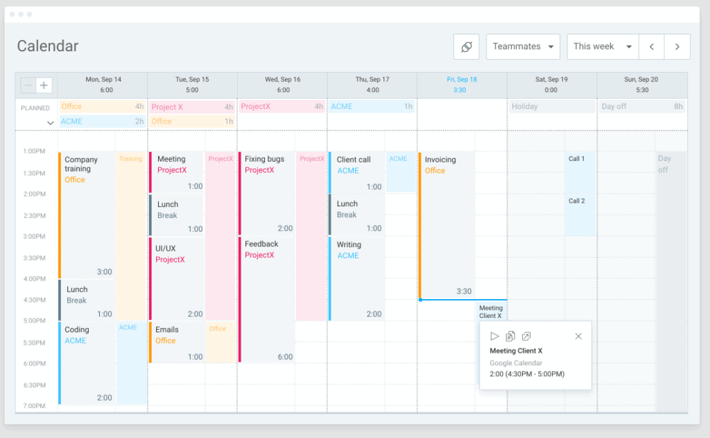
Digital calendar interfaces are moving away from skeuomorphism towards designs that prioritize data density and quick comprehension, especially crucial for glancing at schedules on the go.
1. Enhanced Color as Function (Not Decoration)
The use of color in digital calendars is strictly defined by function, aligning with Time Blocking strategies. Instead of complex gradients, expect bold, clear color assignments:
- Systemic Saturation: A high saturation color (e.g., bright cyan) is reserved only for immediate, high-priority actions (e.g., “Must Do Today” tasks).
- Muted Defaults: Default calendar views utilize soft, muted colors (grays, light blues) for standard meetings, making urgent items pop visually.
- The “Heat Map” View: Advanced calendar tools offer a dynamic view where days or weeks are colored based on the density of appointments, acting as a visual Workload Indicator for quick planning decisions.
2. Modular Widget Interfaces
Following the successful integration of desktop and mobile widgets, digital calendar apps offer increasingly customizable, modular views. Users can drag and drop discrete planning elements.
- Daily Focus Block: A dedicated, small widget showing only the current day’s MITs (Most Important Tasks) and the next scheduled meeting.
- Asymmetrical Timeline: Digital layouts are experimenting with asymmetrical timelines that visually emphasize the *present moment* while smoothly fading the past and future events, improving situational awareness.
3. Focus on Typography Hierarchy
Legibility is paramount. Digital designs rely on clean, modern sans-serif fonts (like Inter or Roboto) and use size and weight to signal importance instantly.
- Bold Time Stamps: The time of an event is often the boldest element, allowing users to scan for time points rather than reading full titles.
- Contextual Font Size: Text for events far in the future may be intentionally smaller or lighter, while today’s events are large and high-contrast, providing a visual filter for relevance.
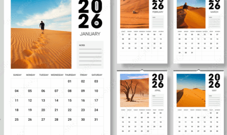
Phase 2: Best Printable Calendar Designs and Versions for 2026
Printable templates offer the therapeutic value of writing and the focused clarity of paper. For 2026, the best printable designs incorporate digital efficiency into a calming aesthetic.
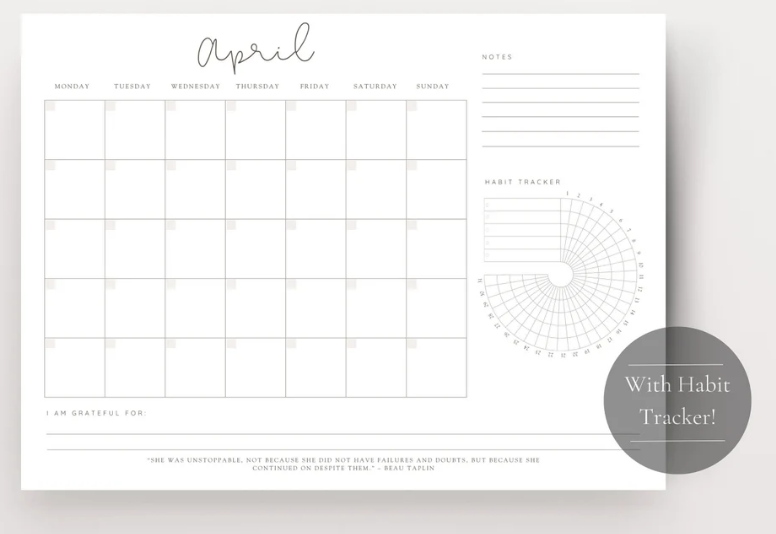
1. The Quiet Aesthetic (Minimalist Printables)
These designs are perfect for users seeking organization without visual stress. They are optimized for home printing and ink saving.
- Black and White Dominance: Printables heavily rely on black text on white backgrounds, often using grayscale shading for weekend blocks or monthly headers instead of full-color ink.
- Dot-Grid Integration: The background of daily boxes features a subtle dot grid, allowing users to write notes, create small diagrams, or track habits (Bullet Journal style) while still maintaining the structure of the calendar grid.
2. Functional Printable Formats
The format of the printable should match the user’s planning needs:
- The Monthly Overview (A4/Letter): Best for high-level tracking (travel, deadlines, bills). Look for templates with a dedicated “Next Month Preview” box and a large notes column for monthly reflection.
- The Weekly Time Block (A3/Desk Pad): Essential for professionals and students. This format features a horizontal layout with vertical columns for each day, often broken into hourly increments to facilitate manual time blocking and tracking Deep Work sessions.
- The Daily Focus Sheet: A dedicated single-page PDF template that includes a main schedule, a small section for the Eisenhower Matrix (Urgent/Important), and a large space for the MITs, acting as a highly focused daily briefing sheet.
Phase 3: Tips for Hybrid Calendar Mastery in 2026
The secret to 2026 productivity is knowing when to use digital and when to use paper.
Tip 1: Digital for Input, Paper for Focus
Use your digital calendar for all input (scheduling meetings, travel, setting automated reminders). Use your printed calendar for focus (transferring your daily MITs and time blocks to the paper). This keeps your digital calendar as the “Single Source of Truth” while leveraging paper for distraction-free execution.
Tip 2: The Color Sync Rule
Maintain consistent color coding between your digital and physical systems. If Deep Work is green in Google Calendar, use a green highlighter or pen on your printed sheet for Deep Work blocks. This visual cue reinforces your focus across both mediums.
Tip 3: The 5-Minute Paper Review
At the start of your workday, spend 5 minutes reviewing the printed version of your daily plan. This short exercise anchors your focus and reduces the temptation to open the digital calendar (and get sucked into email notifications) during your critical morning hours.

Conclusion: Design Aligned with Purpose
For 2026, the best calendar designs—digital and printable—are characterized by purposeful simplicity. By choosing digital tools that prioritize functional color and clear typography, and by utilizing printable versions that support the Time Blocking methodology and Quiet Aesthetic, you can create a seamless, integrated system. This integration ensures that your calendar is not just a passive recorder of events, but an active, aesthetically refined tool driving maximum efficiency and reducing daily stress.