As the digital landscape continues to dominate, the appeal of the physical, well-designed calendar remains stronger than ever. For 2026, calendar design trends are synthesizing digital efficiency with tactile comfort, focusing on aesthetics that enhance productivity and bring visual calm. Whether you are seeking a desk planner, a wall calendar, or a beautifully organized printable template, the best designs go beyond mere utility to become a statement of personal style. This ultimate guide explores the top aesthetic and design trends and outlines the best formats for printable calendars for the year 2026.
Trend 1: Quiet Minimalism and Textured Neutrals
Moving past the harsh black-and-white austerity of previous years, 2026 embraces Quiet Minimalism, a trend characterized by soft colors, natural textures, and a focus on highly functional negative space.
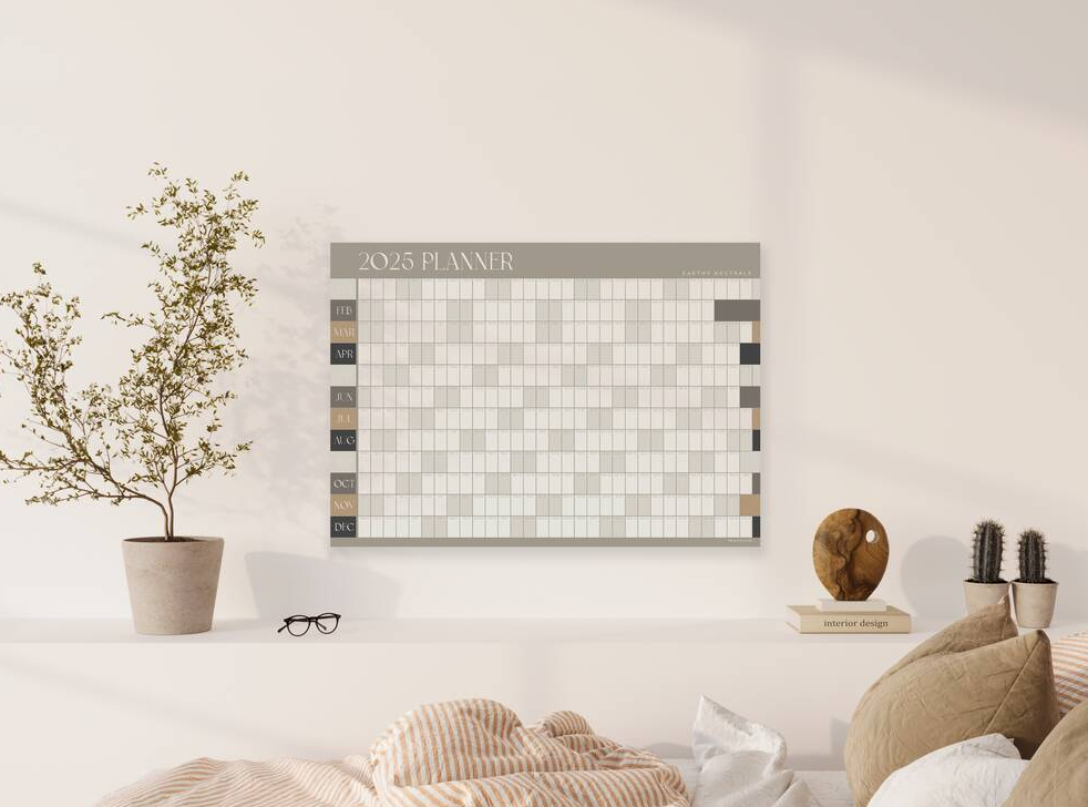
- Earthy & Muted Palettes: Expect to see calendars dominated by soft, muted colors—terracotta, slate gray, sage green, and warm beige. These tones reduce visual fatigue and blend seamlessly into sophisticated home and office environments.
- Tactile Materials: For physical calendars, the design statement is in the material. Think heavy, uncoated cardstock, subtle debossing for dates, and visible paper grain. The design aims for a high-end, artisan feel.
- Functional Negative Space: Large, intentional white space is used not just for aesthetics, but as a deliberate area for quick note-taking, aligning design with the functional need for margin and clarity.
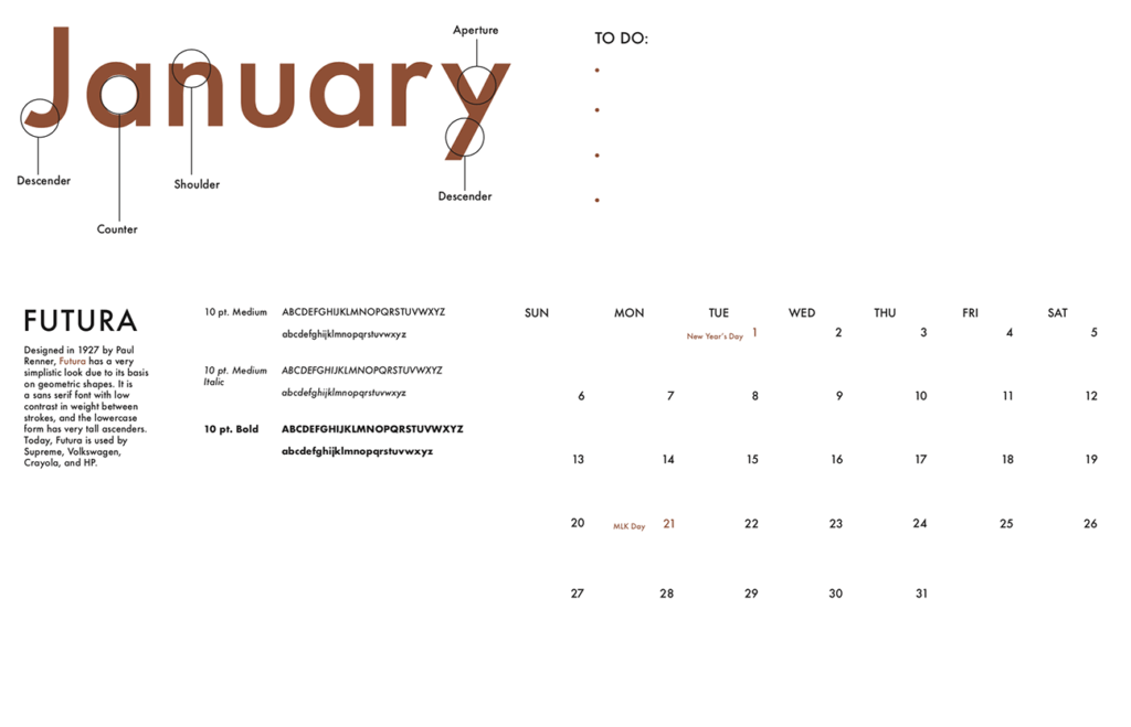
Trend 2: Typographic Dominance and Legibility
In minimalist calendars, typography is the core artistic element. For 2026, the focus is on maximizing legibility and using font hierarchy to guide the user’s eye, often integrating architectural influences.
Contemporary Geometric Sans
Clean, geometric sans-serif fonts remain popular for their readability and modern feel. However, designers are pairing them with unexpected elements:
- Oversized Month Headers: The month name (e.g., JANUARY) often takes up a disproportionate amount of space, acting as a decorative header while maintaining an immediate, single-glance identifier.
- Grid-Breaking Dates: Some designs will break the rigid symmetrical grid, positioning the date numbers along the edges or corners, creating an asymmetrical but orderly look that feels bespoke.
Trend 3: Digital Integration with Physical Comfort
The best 2026 designs recognize that users live in both a digital and physical world. The aesthetic acts as a bridge between high-tech efficiency and low-tech relaxation.
- Widget-Style Layouts: Printable monthly templates increasingly resemble large digital widgets—clean, contained blocks with high information density, making them feel familiar and easy to transfer information to or from a digital device.
- Themed Icons: Minimalist iconography is used for quick visual coding. Simple, monochromatic icons (e.g., a small plane for travel, a tiny barbell for gym time) replace lengthy notes, adding efficiency without clutter.
- Dot-Grid Hybrids: Combining the structure of a calendar with the flexibility of a Bullet Journal or dot-grid background offers users freedom to draw or write outside the lines of the fixed calendar grid.
Best Printable Calendar Versions for 2026
Printable calendars offer unparalleled customization and affordability. Selecting the right format depends on your planning needs—from macro-planning to daily time blocking.
1. The Vertical Monthly Planner (A4/Letter)
This is the most popular and versatile format. The design typically prioritizes a tall, rectangular space for each day. Best for: At-a-glance scheduling, family activity coordination, and high-level goal tracking. Look for templates that include a sidebar for monthly goals or reflection.
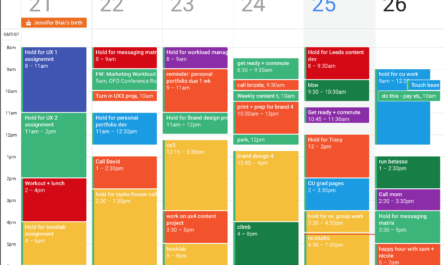
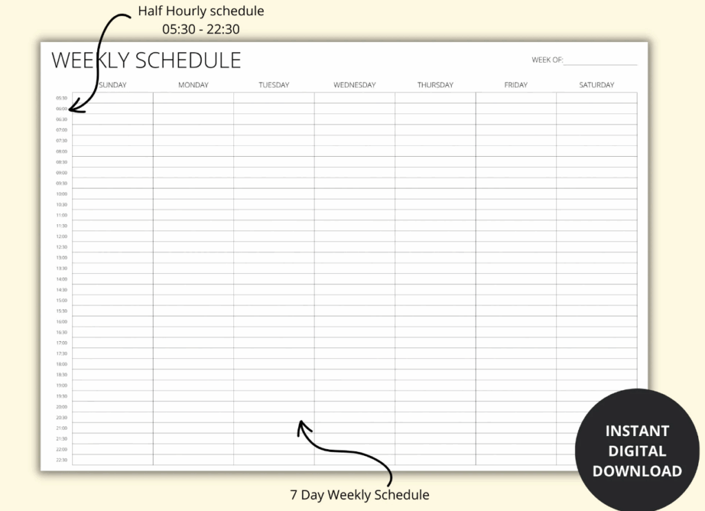
2. The Horizontal Weekly Time Blocker (Legal/A3)
For high-productivity users and time management enthusiasts, the weekly view is essential. Horizontal layouts, often printed on larger paper, allow for a dedicated section for each day, often broken down into hourly or two-hour slots. Best for: Implementing time blocking strategies, tracking client appointments, and managing a detailed work schedule.
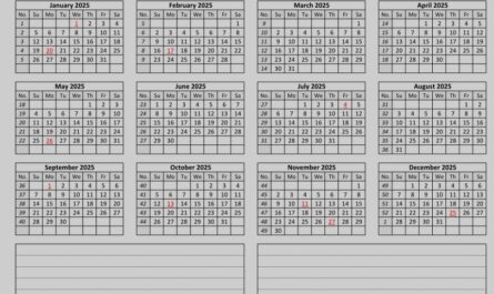
3. The Quarterly/Yearly Tracker (Poster Size)
These large formats (often A2 or poster size) display the entire year or a full quarter on a single sheet. Best for: Project managers, educators planning semesters, or businesses tracking annual marketing cycles. The minimalist trend ensures these large sheets remain readable by focusing on tiny, clean typography and minimal color.
Tips for Maximizing Productivity with Aesthetic Calendars
A beautiful calendar is only effective if it’s utilized correctly. Apply these quick tips to turn aesthetic design into functional productivity:
- Use the ‘One Pen’ Rule: Stick to a single color pen (black or blue) for writing to maintain the clean aesthetic. Reserve a highlighter or a sticker for urgent tasks only.
- Color as Function: Use color-coded accessories (e.g., sticky notes or small dots) to categorize events rather than marking directly on the pristine template. This keeps the design clean while adding necessary visual coding.
- Weekly Migration: At the start of each week, transfer high-level goals from the monthly view to the weekly view. This process prevents overwhelming clutter on the larger monthly calendar.
The calendar design trends for 2026 reflect a wider cultural demand for simplicity, quality, and mindful organization. The best aesthetics—from textured neutrals and dominant typography to dot-grid hybrids—are those that serve the user’s need for clarity first.
By choosing a printable version that aligns with your specific planning methodology (monthly overview, weekly time block, or yearly tracker) and embracing the calming aesthetic of Quiet Minimalism, your 2026 calendar can become a powerful, beautiful tool for achieving both personal and professional goals.